
“Columbia and Tristar”


The Tristar Logo has less of a cinematic quality then it’s predecessor, there’s no musical score building up and the camera is in one stationary place but the image of a winged horse in the clouds is still very memorable and has its own little magical feel that always gets me in the mood for a fantasy flick.

“DreamWorks”
.jpg)

Films like “Shrek”, “Bee Movie” and the “Madagascar” films often feature characters from the movie up there on the moon where the boy is usually fishing.
.jpg)
.jpg)
“Monsters vs. Aliens” had a fun little spoof, having the company logo get abducted by an alien space ship.
.jpg)
.jpg)
My favorite example would have to be in the opening of “Shark Tale”, in which the worm at the end of the boys fishing poll plummets into the ocean, where the movies lead characters are.
.jpg)
.jpg)
.jpg)
.jpg)
“Paramount Pictures”
Paramount has a relatively simple, yet still quiet memorable logo. However, it’s probably my least favorite of all the classic movie studio logos because it really isn’t anything more than a mountain with some cool stars above it, there’s no musical score or anything really that grand but it is still memorable.

It was defiantly put to good use with the “Indiana Jones” movies, which all begin by having the Paramount mountain dissolve into an actual mountain or something that takes place in the first location of the movie.


“MGM: Metro Goldwyn Mayer”
.jpg)
MGM is the only studio I can think of to use an animal mascot as the company’s logo and it looks great. Something about a single lion giving a mighty roar before the films begins is really cool.
There’s been some fun twists on this logo too, usually involving something or someone else standing in the center place where the lion is. Before every “Tom and Jerry” cartoon, the cat Jerry would appear growling in the lions place. My favorite example would be in the opening of the 2002 movie “The Crocodile Hunter: Collision Course”, which featured a crocodile in the center piece.


“Walt Disney Pictures”

Oh Disney, there logo’s about as timeless as there classic animated movies. My favorite by far is that classic logo that started in the late 1970’s, it’s simply the castle silhouetted agents a blue backdrop with five simple musical notes playing in the background. Even though it’s not as grand as the current logo it still feels more times, nostalgic and it conveys just the right charms to get me in the mood for a Disney movie.

The current Walt Disney studio logo is still really good and took about a year to make. It’s doesn’t have the same simple charm of the first and is a lot busier, with all those fireworks going off in the background but it’s definitely brought up on a grander scale then before and the new musical rendition of the song “When you wish Upon as Star” is a really nice touch. This logo was brought to life by the same visual effects company that supplied the effects for “Avatar” and “The Lord of the Rings” movies, and was put to great use in the opening of Disney’s 2007 movie “Enchanted”, which actually transported the audience into the castle.
“Warner Brothers”

It’s hard to explain why but the WB shield has always been one of my favorite logos, something about a giant shield in the sky with those colors make it so easy to like. One of my favorite renditions of this logo features the studio in silhouetted against golden colors which then pulls back revealing the logo in all its triumphant glory. I especially love the orchestrated rendition of the song “As time Goes By”.

There was also that simple little piano jingle that would play with the logo dissolving into frame, this was part of their home video releases that started in 1992 and is still going to this day. Another favorite rendition of mine is WB’s home video logo that aired from 1970 through 1985, that was like a mini epic and the music got me so hyped.


The WB logo had a different into created for their Family Entertainment Pictures, which featured a nice little melody of “Merrily we go Along” and the pleasant appearance of Bugs Bunny in a suit, much like the classic Disney logo, this one also has it’s timeless, nostalgic charms. There’s also been a few fun renditions of this logo that would feature other characters alongside Bugs Bunny, like this clip from “Waco’s World”, which features one of “The Animaniacs”.


Speaking of Nostalgia, I’ll always have fond memories of the classic Kids WB logo (I’ll have to talk about that some other time).


I also think that the WB logo is used in the openings of more movies than any other studio logo. It was put to great use in the openings of the 90’s “Batman” movies which would feature the WB shield going blue and then dissolve into the Batman logo.

It’s was also used very well in the openings of “The Matrix” movies, giving it that green tinted color.
.jpg)
.jpg)
But the best example by far is in the openings of the “Harry Potter” movies, which would bring the shield to life on a big scale and made it look stellar in 3D. I don’t think that the WB shield will ever look as awesome as it did in those movies.
.jpg)
.jpg)
“Universal Studios”

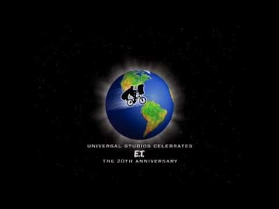
Personally the Universal Studios Logo is my absolute favorite company logo. Seeing the planet Earth makes things feels larger than life and it always gives me a great feeling that the movie I’m about to see is really special. The current rendition of the Universal logo began in 1997 and it’s simply stunning, with all those bright lights shining out of the planet and that triumphant music composed by the late great Jerry Goldsmith, it’s like the most epic logo ever.

The great John Williams also composed a rendition of this little musical score for the 20th anniversary edition of “E.T. The Extra Terrestrial”, which also featured the characters flying in front of the planet as opposed to the moon.

Many other Universal blockbusters would put some fun spins on this logo, like “The Mummy” which had the planet dissolve into the sun and in the opening of the 1995 film “Water World”, the camera pulls forward to the planet and goes past the Universal title. The most artistic by far was in the opening to “Scot Pilgrim vs. the World”, where the logo was presented in a visual effects style that was reminiscent of a classic video game.

Naturally, as a child in the 1990’s, I grew up with a lot of Universals children films like “The Land Before Time” series and the logo for those particular films would feature this cute little airplane that would correct a typo in the spelling of Universal. I can’t explain why, but this intro brought me so much joy as a kid.


My personal favorite is the special edition opening of “Back to the Future Part 3” which quickly showed the company’s logo go through its full history of different changes.


“20th Century Fox”

Even though the Universal logo is my favorite, I couldn’t imagine ending this post with any other company logo than 20th Century Fox. It’s like the classic studio logo that always seems to be every ones favorite, those great big searchlights certainly make it feel like something strait from Hollywood and of cores it’s impossible not to think of “Star Wars” when you here that music.

Like all the other logos I’ve mentioned, this one’s had its share of fun twists. It was re-decorated in the opening of "Garfeild" and in the opening of “The Simpsons Movie” it featured our favorite bully singing along with the music.


The “Ice Age” movies seem to make a tradition of inserting the logo into the openings of their films.


The best example, actually my favorite spin ever to be put on a studio logo would to be the opening of the 2001 motion picture “Moulin Rouge”, which featured a maestro bringing up the logo like it was part of an on stage performance.
.jpg)
That's All Folks!
.jpg)
This is very interesting content! I have thoroughly enjoyed reading your points and have come to the conclusion that you are right about many of them. You are great. read
ReplyDeleteThanks, I love making these posts for people like you to read.
DeleteNice ending with 20th century Fox:) p.s. Tcf is my favourite logo
ReplyDeleteHello
ReplyDelete